META Development · Website redesign
Three directions, five pages each.
Same brand colors, same copy and assets. Each option has its own type pairing, layout logic and motion. Open one, then switch pages from its nav; add /mobile to the URL hash (e.g. #home/mobile) or use the Viewport tweak to preview the phone layout.
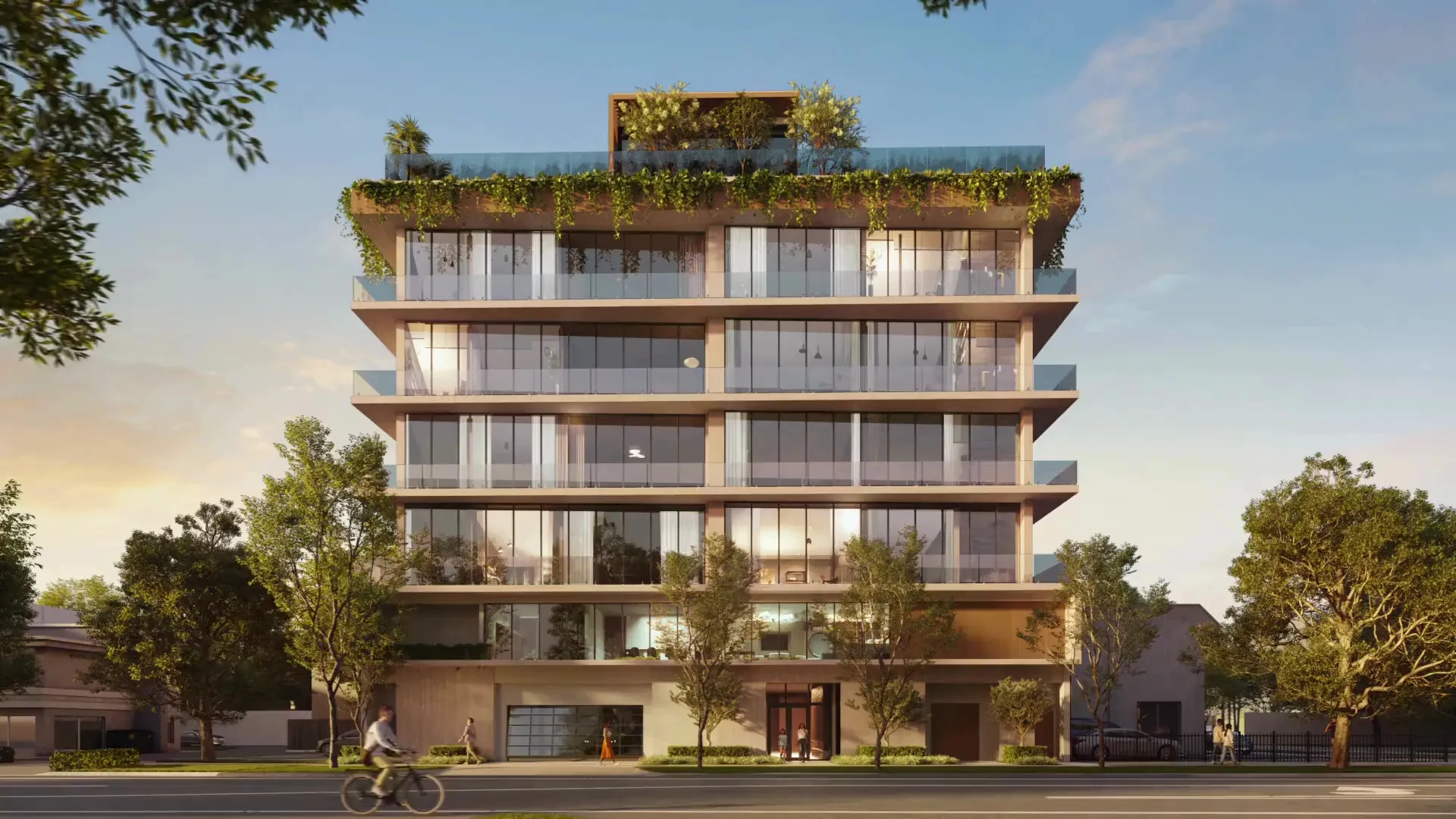
Light paper, architectural grid lines and a chaptered, numbered flow. Spectral + Josefin Sans. Each development takes a full screen with a floating fact card; stats count up; a custom “Discover” cursor over imagery.
- Light
- Editorial grid
- Full-screen projects

Wine and forest textures alternate like pages of a book; centered Cormorant headlines, a marquee ticker and a horizontal project strip with numbered counters. Pill buttons, progress bar, sticky manifesto column. Tenor Sans for labels.
- Wine / forest
- Centered
- Horizontal strip
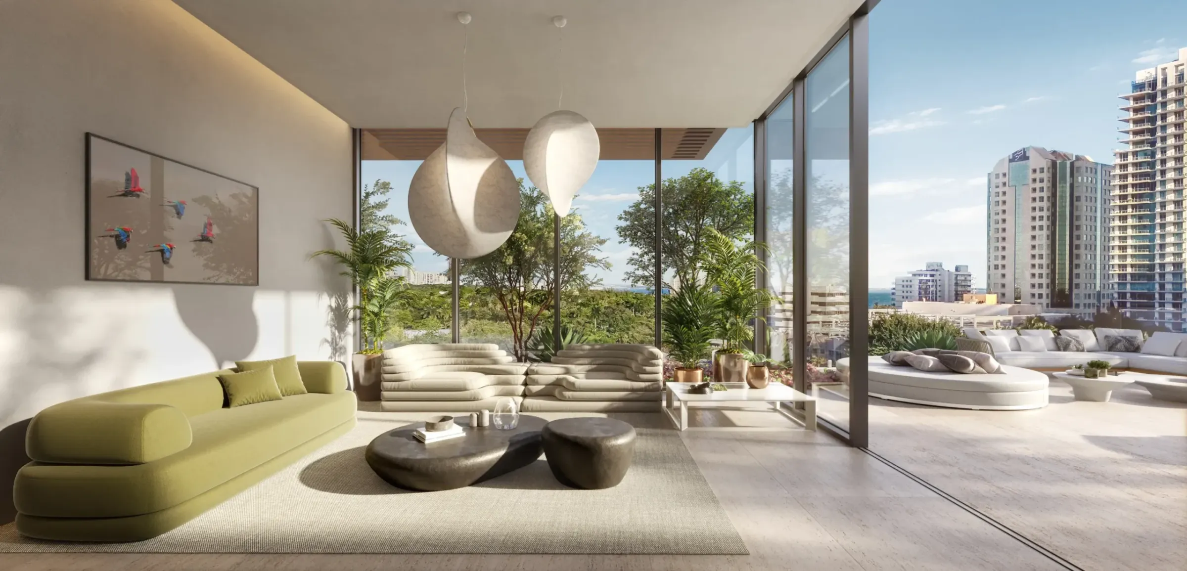
Ink-dark, cinematic. Every home section is a full-viewport scene with imagery as the ground; Prata headlines with copper accents, Urbanist body. Split hero, scene dots on the right, expanding neighborhood panels, glass info cards, partner marquee.
- Dark
- Full-bleed scenes
- Copper accent
Stats (4.5M sq ft · $8.0B) are placeholders marked with an asterisk, as requested. Neighborhood blurbs and amenity lists are new copy for you to confirm.